Gary Larson on the Creative Process

GaryLarson.JPG

Constraints, even arbitrary ones, are central to the creative process. Constraints force us to consider new alternatives, discard subconscious assumptions, and think outside the box. I've written about this before, but I'll be the first to admit that I lack the gravitas that others might bring to the issue. Gary Larson, for instance, has published 23 books, drawn a cover for the New Yorker, and even has a species of lice named after him. And here's what he says about his art:

Because The Far Side is a vertical, single-panel cartoon, I've rarely had the luxury of being able to draw long things (like whales, snakes, ships, etc.) in an accommodating shape. In general, the perspective has to be from front to rear, as opposed to side to side…
In cartoon strips, you frequently see the latter approach - because the strip lends itself well to horizontal images. In The Far Side... ships come at you head on, classrooms are viewed from either the front or the back, and riding in the car is often seen from the perspective of the backseat looking forward or from the windshield looking inward. I just can't draw a '59 Cadillac in profile. 
I'm saying this because I drew The Far Side for years without truly being cognizant of why I approached it this way. I was just trying to figure out ways to cram things into a little rectangle. It was a friend of mine (also a cartoonist) who pointed out that I had inadvertently developed one or two drawing skills in the process. 
The limitation of space I fought in the beginning ended up being the best drawing instructor I ever had.

From Larson's 1989 The PreHistory of the Far Side. Published without any accompanying cartoons per the artist's wishes.

Clutter Your Way to Creativity

cluttered-room.jpg

 We'll keep with a theme this week: the spaces around us matter. And this bit of research,* published by a team from the University of Minnesota in Psychological Science, is worth paying attention to: it's an excuse to stop cleaning. Forever.

In a recent series of experiments, Kathleen Vohs and her colleagues set out to test the effect of desk and office cleanliness on productivity, creativity, and decision making. Subjects were first asked to fill out questionnaires in an office. Some did so in a prim and well-ordered space, while others did so in one cluttered supplies and strewn with papers. Afterwards, those in the clean office behaved in a more "pro social" fashion: they donated more money to charity when given the opportunity, and they grabbed apples rather than chocolate on their way out the door. 

But messiness has its advantages as well. In a second experiment, subjects were tasked with coming up with new uses for ping pong balls. Although the clean room subjects generated the same number of uses as those in the messy room, the latter group came up with ideas that were rated as more interesting and creative by a panel of two external judges. This creative bent also carried through in a third experiment, which found participants in a messy room to be more likely to prefer a novel smoothy flavor over the conventional one. The conclusion is that "disorderly environments seem to inspire breaking free of tradition, which can produce fresh insights", while orderly environments "encourage convention and playing it safe."

None of this is exactly new, as there's apparently been an "anti-anticlutter movement" that's been singing the praises of crammed closets and messy desks for some years now. At the same time, it's always nice to see wishful thinking be put to the test. And if nothing else, it's a great excuse to put off cleaning your desk for another day.

 I can only assume it works for the dishes in the sink too. 


*Vohs, Kathleen D., Joseph P. Redden, and Ryan Rahinel. 2013. "Physical Order Produces Healthy Choices, Generosity, Conventionality, Whereas Disorder Produces Creativity." Psychological Science. 


A Cardboard Palace

Back in June 2010 my department moved to a new home in the Huang Engineering Center,  the second building in Stanford's new state of the art Engineering quad. Not only did our new building differ from its predecessor in terms of termite resistance and earthquake code compliance, it also boasted an airy open office floor plan designed to boost collaboration and community among students.

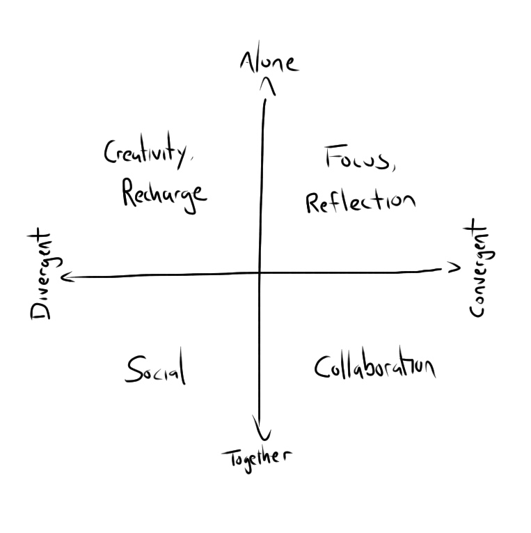
Unfortunately, no one asked the students whether they actually WANTED to collaborate, and (as it turns out) most students simply want to put their heads down and be left alone. The result? On any given day, 80% of the desks in our new, social space sit empty. This "utilization rate" is well below typical levels, and it makes the prospect of commuting 1.5 hours to sit in a ghost town pretty unappealing.

This isn't ideal. It's a waste of capital and space (we could get by with 80% fewer desks), and it hinders the community and chance interactions that are so critical to creativity, innovation, and good research. Unfortunately, fixing the problem and meeting the needs of the hundred students that share the space isn't exactly easy.

photo (17).JPG
Work_Graph.jpg

And that's what's given rise to the new cardboard village that's sprouted up in one of our atria. The new space (designed by consultants from Steelcase), seeks to meet all of these diverse student needs with flexible workspaces, sit-stand desks, and small multi-desk "studios" that will house various communities of practice while cutting down on overall noise. These flexible workspaces are the latest trend for a workforce that's increasingly mobile and has come to see long stints sitting in sterile offices as "our generation's smoking". The next few months will see increasingly "real" prototypes, until at some point we get kicked out, walls get thrown up, and we (eventually) move into our new home. Given the cost involved (and the politics), it won't be a fast process, but when the renovations are done they may greatly improve the quality of life (and research) in the building.

Fortunately for me, I'll probably still be here.

Diss_Graph.jpg

When Less is More

Although there's plenty of research that highlights the importance of constraints in creativity and innovation, it's often hard to imagine that being true in our own lives. After all, if I can cook this delicious meal in my own kitchen, imagine what I could do with double the budget!

Less is often more, though, and I recently had a chance to see that maxim in action by taking part in Research As Design, a short-form course designed by Marilyn Cornelius, Amanda Cravens, Anja Nabergoj, Nicola Ulibarri, and Adam Royalty, now in its eleventh iteration at Stanford. The basic premise of the course is that although research can be an enormously creative endeavor, academics rarely have any real training in the creative process. The course goal is thus to apply the design thinking mindset and tool kit to the process of academic research. If you're at Stanford, I highly recommend participating. If you're not, get in touch with Marilyn anyway: they've got great lessons and they're eager to share.

The prompt for this post, though, was a momentary outburst of frustration from one of the students during a brainstorming exercise. We were working as a group to identify solutions to an issue in our research when the instructors imposed an arbitrary constraint: the solution had to cost a million dollars or more. It honestly made no sense. How do you stay focused while working on a difficult problem? Jewel-encrusted headphones. Build a private office on a desert island. Hire Ryan Gosling to distract the people who were trying to distract you. What?

The goal of brainstorming is to encourage outside-the-box thinking. Adding arbitrary, or even silly, constraints does this by making you think of crazy, impractical, or even impossible solutions. Not only might one of these "crazy" solutions turn out to be totally feasible, but at the very least you're forced to identify (and maybe ignore) the implicit assumptions that had constrained you before. It sounds crazy, but it works.

And here's a testimony to prove it. Phil Hansen is an artist who suffered irreparable nerve damage that eliminated his ability to draw straight lines. Rather than being stymied, he took this constraint and used it to launch his art into a new realm of creative (and sometimes crazy) expression. Take a few minutes to watch his 2013 TED talk here: